This One Slider May Be Lightroom's Best Tool Yet
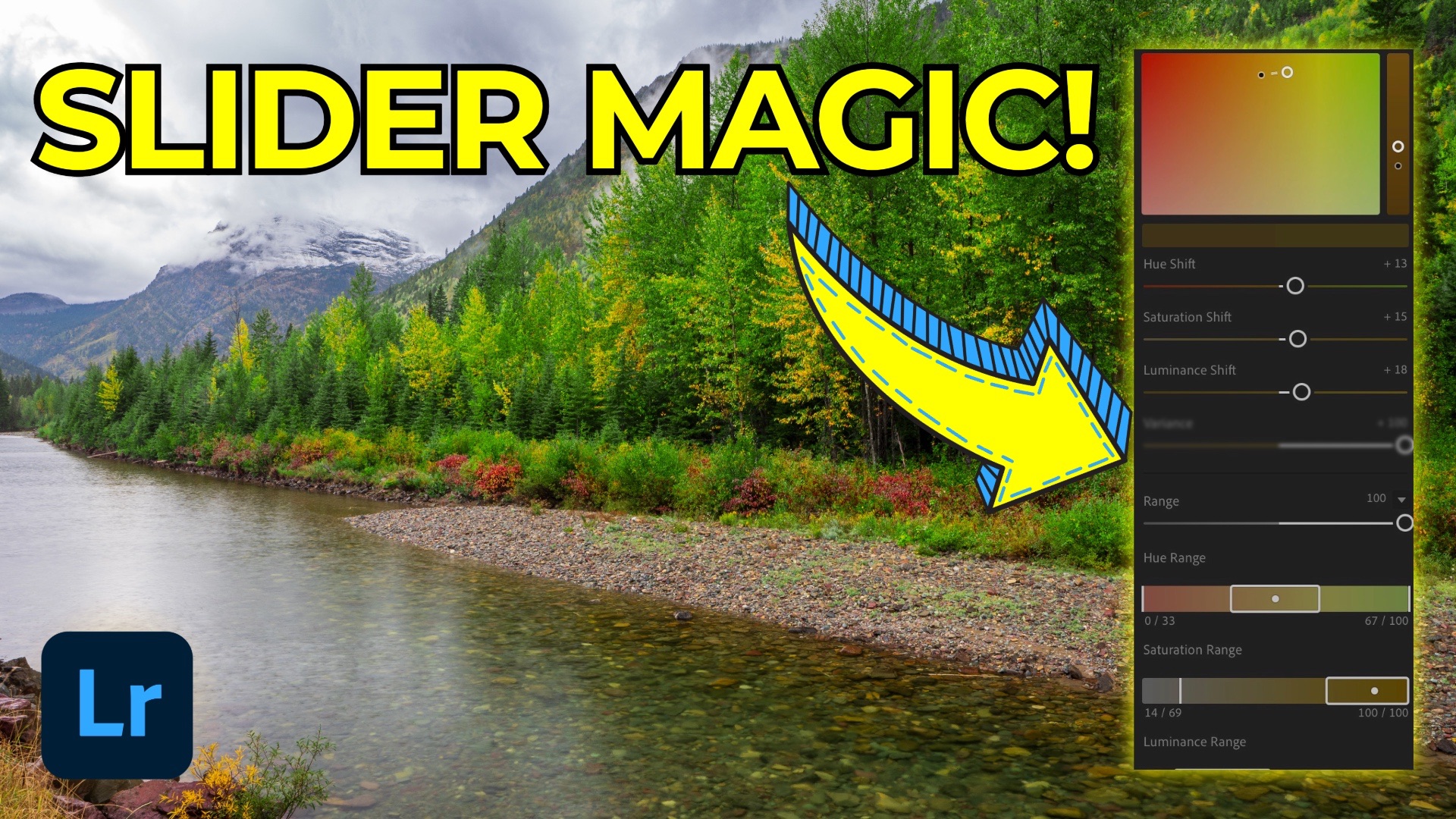
Every so often, a new tool gets added to Lightroom that seems subtle at first glance but ends up having a profound impact on how you edit your photos. One such tool—quietly introduced in the Lightroom 9.0 update at Adobe Max 2025—is the new Color Variance slider inside the Point Color panel.
While it may seem like just a single slider, Color Variance offers nuanced control over color harmony and separation, depending on how you use it. In this post, I’ll walk through how it works and why it’s now a permanent part of both my portrait and landscape workflows.
What Is Color Variance?
Located within the Point Color panel (first introduced in 2023), the Color Variance slider lets you either:
-
Increase color contrast—pushing colors apart, making them more distinct
-
Decrease color contrast—harmonizing colors and smoothing out visual differences
What makes it powerful is the intentionality it brings. You’re no longer relying on broader global sliders to “kind of” get the result you want—you can now isolate a hue and finely tune how surrounding tones interact with it.
Portrait Workflow: Evening Out Complexions
Let’s start with portraiture.
Skin tones often contain subtle shifts in hue—cheeks might appear redder, shadows cooler, and foreheads slightly more yellow. Traditionally, evening these out involved careful local adjustments with multiple sliders.
Now? One slider and one mask.
Using Lightroom’s AI-powered subject detection, I created separate facial skin masks for two subjects. Then, I used the Point Color dropper to sample a mid-range hue in the skin—neither the lightest nor darkest—and adjusted the Color Variance slider to the left. This harmonized their skin tone beautifully, reducing harsh color differences without flattening the natural look.
Tip from a Lightroom engineer) Keep all Point Color adjustments—hue, saturation, luminance, and variance—on a single mask for best results. Use a second mask for additional edits.
Landscape Workflow: Fixing Uneven Skies
Polarizer filters are a landscape staple—but they come with quirks. On wide lenses, they can cause uneven skies: bright in one area, dark in another.
In one of my examples, I used Color Variance in a local sky mask to solve this. After masking the sky with Lightroom’s adaptive tool, I sampled a mid-blue from the sky and pulled the slider to the left, reducing the uneven tones and smoothing out the gradient.
To refine it even further, I adjusted:
-
Hue Shift: Pulled the sky bluer
-
Saturation Shift: Boosted color intensity
-
Luminance Shift: Brightened the result
-
Range Slider: Controlled how much color fell into the target range
The end result? A seamless, even sky that looks like it was captured with a perfect filter setup.
Landscape Workflow: Enhancing Fall Foliage
Sometimes you want to go the other way—to make colors more distinct.
In a fall foliage photo, I sampled a yellow-orange leaf and pushed the Color Variance slider to the right. The result? Greater separation between reds, yellows, and greens, making the foliage pop. Adding modest hue, saturation, and luminance shifts took it even further.
This is a great use case for global editing—no mask needed. But of course, you could easily localize it if needed.
Why This Slider Matters
It’s just one slider. But paired with the precision of Point Color and the targeting power of masking, Color Variance can fundamentally reshape how you edit.
Whether you want smooth skin, an even sky, or vibrant leaves, this slider gives you surgical control over color without heavy lifting. Try it out. Experiment. And once you get the hang of it, you’ll wonder how you ever edited without it.
It's Time to Learn How To Use Lightroom Everywhere!
If you enjoyed this topic and want to learn how to get the most out of Lightroom's cloud-based ecosystem on the desktop, smartphone, and tablet, then you should check out my Lightroom Everywhere course! It has over 12 hours of easy-paced lessons that'll teach you how to make the most out of Lightroom Desktop, Mobile, and Web.
The Only Course Designed to Help You Use Lightroom Everywhere!


