Almost Every Lightroom User Ignores This One Critical Slider
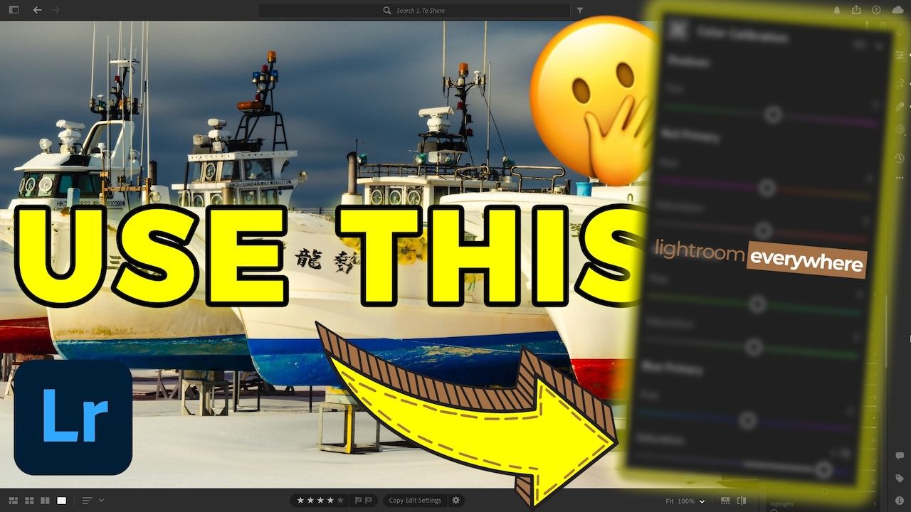
If you told me that I could only use one slider in Lightroom to edit my photos for the rest of time, I'd immediately choose the Blue Primary Saturation slider within the Color Calibration panel. But wait. You are a Lightroom (not Classic) user, and you don't know what I'm talking about when I mention the Color Calibration panel?
There's a good reason for it. It is hidden by default; unless you know how to enable it, you can go your entire life without realizing it's there. Of course, if you're enrolled in my Lightroom Everywhere course, you'll learn about how to access it 😉. Not to worry, though! I'll show you how to enable it in the tutorial video below. One important note is that the Color Calibration panel is only available in Lightroom Desktop (and Classic), not in Lightroom Mobile. 😢
Alright, let's get back to the Color Calibration panel. In this article and video below, I explain how the Color Calibration panel tools differ from the Color Mixer tools. For example, how does the Color Mixer's blue Saturation slider differ from the Color Calibration blue Saturation slider? It's an important question because the difference in functionality will dictate how to use both of them and which photos would benefit from each.
Color Calibration vs Color Mixer
At a very high level, the key difference between the Color Calibration saturation sliders and the Color Mixer saturation sliders has to do with where they're applied. The easiest analogy I can provide is to compare how you edit a photo. Typically, you'd make one of two types of edits: global and local edits. Global edits are applied throughout your entire image, and local edits are made to a specific region using a selection tool or mask. That same principle can be applied to these two color panels.
When you use the Color Calibration sliders, you're adjusting the respective primary color in every pixel within your photo (i.e., global). Because every pixel contains a combination of red, green, and blue, the resulting edits can be dramatic.
Conversely, the Color Mixer sliders only affect the color area where the respective color is perceived (i.e., local).
In the video, I use the following image I created containing three circles: a RED one, a GREEN one, and a BLUE one. I'm including it here in case you would like to download it and experiment with the Color Calibration and Color Mixer sliders for yourselves. All you need to do is right-click on it and save it to your computer.

Not convinced? Check out the following before and after images. The only edit I applied to the image was adjusting the Blue Primary Saturation slider.

Original, unedited photo

Edited using only the Blue Primary Saturation slider, set to 100%
Do you see how much more vibrant all the colors throughout the image are, not just the blue ones? And it looks completely natural and tasteful. None of the colors are overly punchy or contrasty. That's why I believe the Color Calibration panel is so powerful.
Lightroom Color Calibration Tutorial Video
Now that I've hyped the Color Calibration tool enough, here is the video explaining how it works and why I think it's one of the most powerful tools in Lightroom. Enjoy!
It's Time to Learn How To Use Lightroom Everywhere!
If you enjoyed this topic and want to learn how to get the most out of Lightroom's cloud-based ecosystem on the desktop, smartphone, and tablet, then you should check out my Lightroom Everywhere course! It has over nine hours of easy-paced lessons that'll teach you how to make the most out of Lightroom Desktop and Mobile.
The Only Course Designed to Help You Use Lightroom Everywhere!


