I Loved This Edit in 2010… Now I Can’t Unsee the Problems
I’ve moved a lot during my adult life, and in a few months I’ll be packing up and heading cross-country once again. While I was born and raised in New York City, Boston was the first city I lived in that wasn’t home. I was there during some very formative years as a photographer, and I have the old files—and mistakes—to prove it.
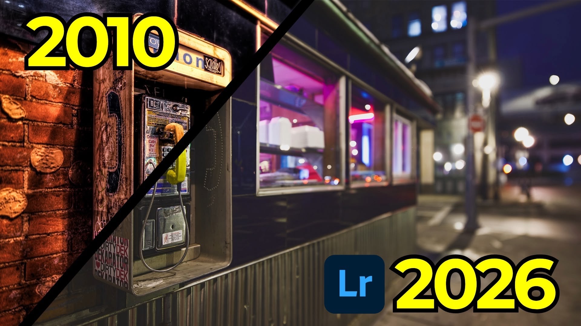
In this entry of my Then and Now series, I went back to January 1st, 2010. It was the first day of the new decade, and I was shooting with a Canon 5D Mark II and my beloved (and heavily overused) Canon 17mm tilt-shift lens. Lightroom looked very different back then, and so did the way I edited.
The Original Edit
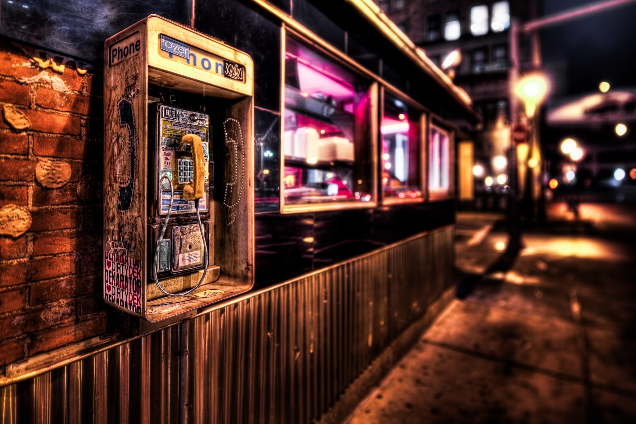
The photo was taken along the side of the South Street Diner in downtown Boston. It was evening, the streets were oddly quiet, and I was drawn to gritty scenes like this. I still like the composition. What doesn’t hold up quite as well is the edit.
The original version is overly crunchy, aggressively sharpened, and full of tonal extremes. At the time, I loved that look. Looking at it now, it feels more like an 8-bit video game than a photograph.
Tilt-Shift: Powerful, but Easy to Overdo
The 17mm tilt-shift lens can do two things: shift and tilt. Shifting is incredibly useful for architecture because it keeps lines straight and avoids distortion. Tilting, when used carefully, can extend depth of field. When used aggressively—as I often did—it creates very shallow and unconventional planes of focus.
In this image, the plane of focus falls vertically across the frame rather than front-to-back. It’s an interesting effect, but I pushed it too far. Combined with shooting wide open at f/4, it became more distracting than intentional.
Bracketing Everything (Whether I Needed It or Not)
Back then, I auto-bracketed almost every scene. This photo was no exception: seven exposures, from minus three to plus three. I likely tone-mapped them using Photomatix and finished the edit with Photoshop plugins like On1 Photo Tools.
Today, I’d approach this very differently. While the scene does have a wide dynamic range, modern raw files—and modern Lightroom—can handle far more than I realized back then. For this re-edit, I used a single raw exposure and skipped tone mapping entirely.
Starting the Re-Edit
I began by correcting white balance. The camera was set to auto white balance, and the color cast was clearly off. Using the metal surface of the payphone as a reference got things close, with a small manual adjustment afterward.
From there, I used Lightroom’s Auto Upright tool to clean up the geometry. Because I had already shifted the lens in-camera, very little correction was needed. A small crop and slight rotation helped clean up the edges of the frame.
Tone and Color, with Restraint
Instead of relying on the Contrast slider, I built contrast using the point curve. A gentle S-curve added depth while keeping highlights under control. I also introduced a little gray into both the black and white points to soften the overall contrast—something I never would have done in 2010.
I reduced refined saturation to avoid pushing colors too far and made subtle adjustments in the blue channel to warm the shadows slightly. Small calibration tweaks to the red and blue primaries helped everything feel more balanced without calling attention to the edit.
Removing Distractions
This is where modern Lightroom really shines. Glue marks, stickers, and small specular highlights pulled my eye away from the subject. Using Generative Remove made quick work of them—something that would have been tedious and unreliable years ago.
Because I used multiple AI-powered tools, Lightroom flagged an edit order warning. Updating the AI edit order ensured everything stayed consistent. If you’re not familiar with that process, it’s worth learning—it matters more than it sounds.
Local Adjustments and Masking
Masking is one of the most important skills to develop in Lightroom today.
I used a linear gradient to enhance texture and clarity only in the area that was already in focus. Then I isolated the yellow payphone receiver using object selection and point color adjustments. Brightening and shifting the hue slightly made it the clear focal point without affecting similar colors elsewhere in the image.
I did the opposite for the blue phone icon and text, darkening and saturating them just enough to balance the frame. A custom radial vignette subtly guided attention toward the left side of the image without crushing highlights.
Sharpening, Carefully
The original edit was massively over-sharpened. This time, sharpening was applied conservatively, with masking used to keep it away from flat areas. The result is detail where it matters, without texture turning brittle.
Then vs. Now

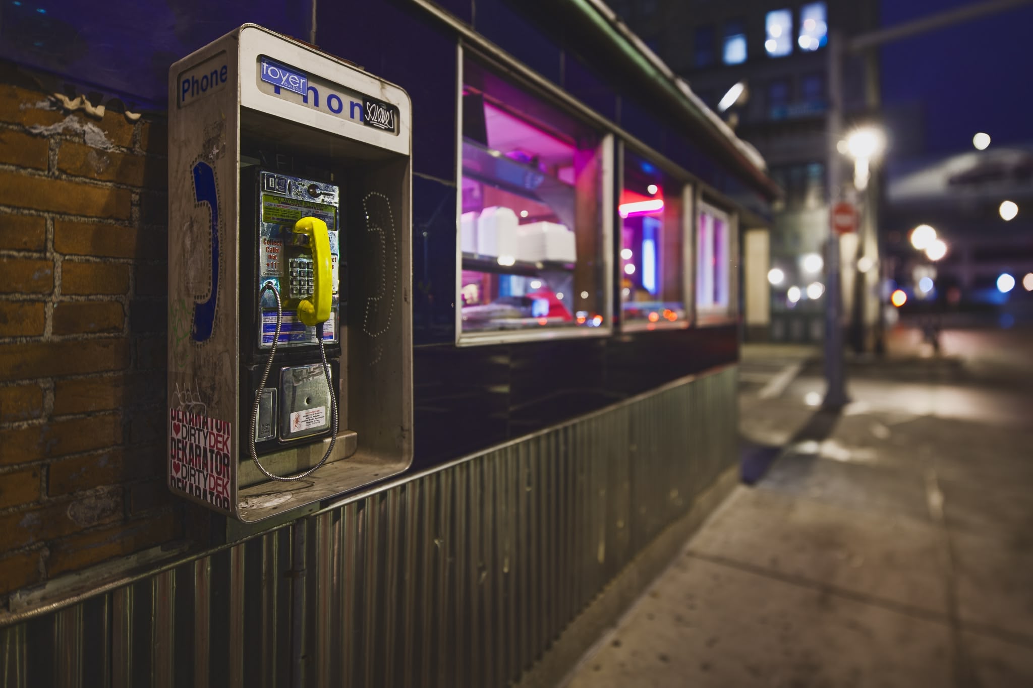
Comparing the two versions side by side is eye-opening. The original edit is harsh, noisy, and uneven. The new version is calmer, more legible, and closer to how the scene actually felt.
That doesn’t mean the original is “wrong.” There’s always at least one person who prefers it—and that’s fine. Tastes change. What matters is keeping your raw files so you can revisit them as your skills, tools, and preferences evolve.
Sixteen years ago, tools like point color, advanced masking, and Generative Remove didn’t exist. Today, they allow us to get more out of old images without forcing them into outdated styles. That’s one of the reasons I love revisiting this work—it’s a reminder that growth is visible, measurable, and ongoing.
It's Time to Learn How To Use Lightroom Everywhere!
If you enjoyed this topic and want to learn how to get the most out of Lightroom's cloud-based ecosystem on the desktop, smartphone, and tablet, then you should check out my Lightroom Everywhere course! It has over 12 hours of easy-paced lessons that'll teach you how to make the most out of Lightroom Desktop, Mobile, and Web.
The Only Course Designed to Help You Use Lightroom Everywhere!


