
5 Editing Habits I Used To Make All The Time (And Never Will Again)
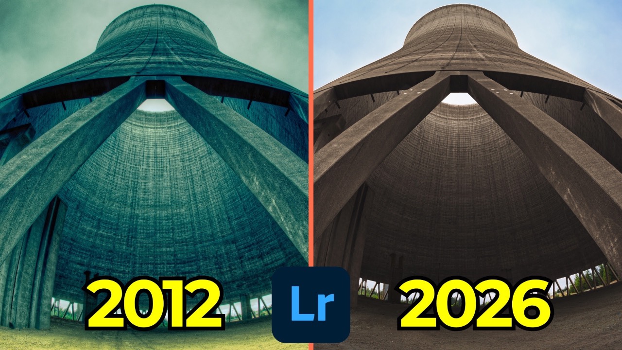
Back on August 18, 2012, some friends and I got permission to shoot inside the abandoned Satsop nuclear plant in Washington. It's still one of the coolest shoots I've ever done. Fourteen years later, almost to the day, I'm bringing this photo back for episode 9 of Then and Now — my series where I take old compositions I still love and re-edit them with current tools and a different set of priorities.
I shot this on a Canon 5D Mark III with my 15mm f/2.8 fisheye — I called it my "funk buster" back then, and I still love that lens. Pointing it straight up turned the structure into something that looks almost like a stone tentacled creature. The composition still holds up. The edit is a different story.
What the 2012 Edit Got Wrong
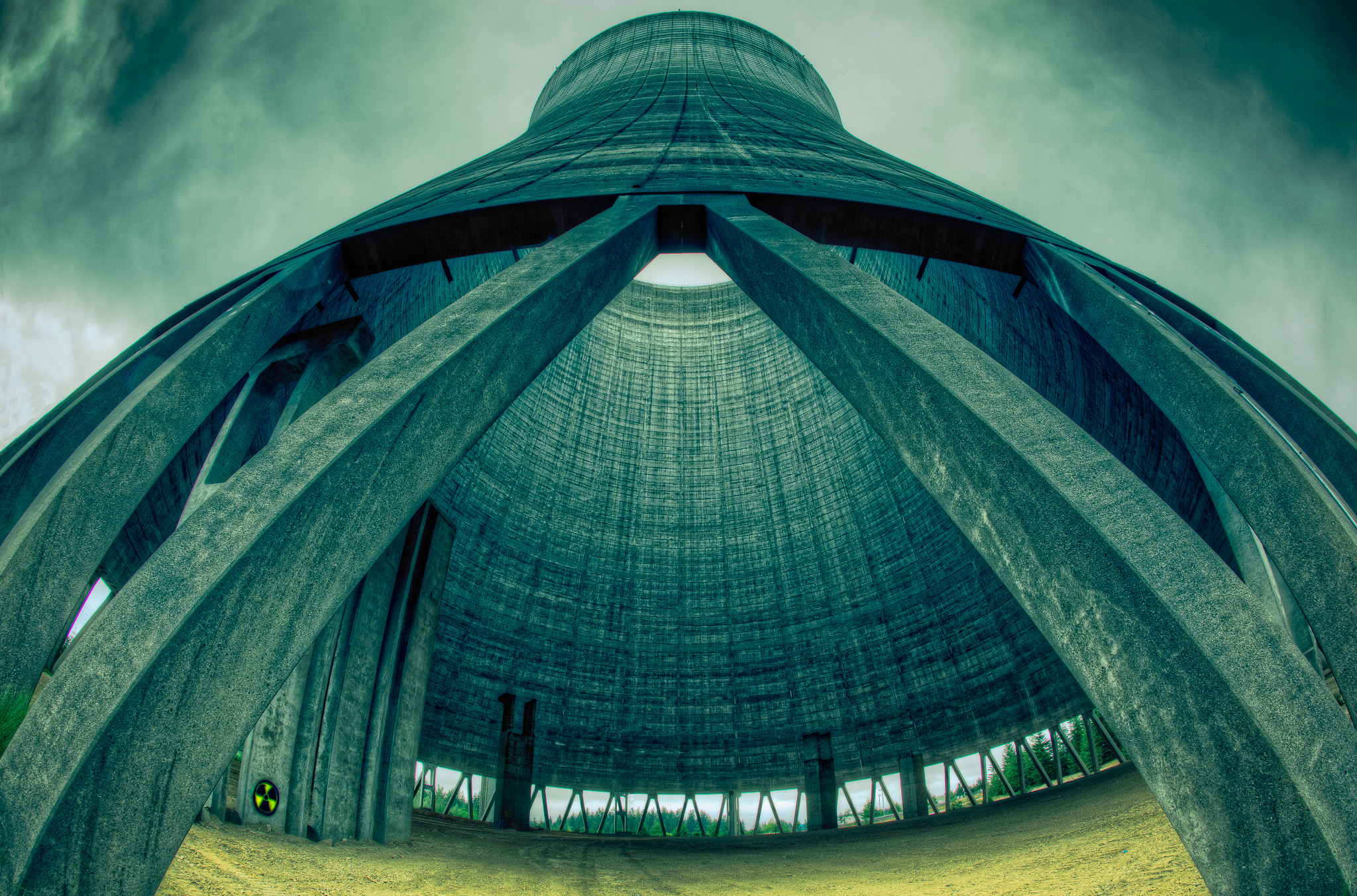
Looking back at the original, a few things jump out immediately:
- Split toning pushed way too far. This was before Lightroom had color grading, so split toning — applying a hue and saturation to highlights and shadows — was the only grading tool available. I used it aggressively. Looking at it now, it reads as a visual assault rather than a stylistic choice.
- Heavy tone mapping. I bracketed the exposure and ran it through Photomatix (the "HDRX" suffix in the file name was my own naming convention for anything that went through that process). It served its purpose at the time, but it's not how I'd approach dynamic range today.
- I removed all the trees. Back then I wanted a "clean" shot of the structure. Now I want the opposite — I want the sense of nature reclaiming a man-made structure, which is a big part of why this location was compelling in the first place.
Removing Distractions Without Generative AI
Lightroom's default remove tool now leans on generative AI, but it's not always necessary. The sky in this shot is flat and simple, so instead of checking the "use generative AI" box, I turned it off and used the older content-aware heal instead. I used a smaller brush and cleaned up a distracting tower jutting out of frame, along with a small cluster of trees I didn't want. It usually takes a couple of passes to fully clean an area, but content-aware heal handled it well here — no need to reach for the heavier tool.
Recovering Ground with Generative Expand
Because of how wide the 15mm fisheye is, I had to tilt the camera up significantly to fit the whole structure in frame, which meant sacrificing foreground. Lightroom's newest update (as of last week) added Generative Expand to the Crop tool, so I used it to pull back some of that lost ground.
A couple of practical notes if you're using this feature:
- It's credit-based unless you're on the Creative Cloud Pro plan (formerly All Apps), in which case Gen Expand generations are unlimited and don't cost credits.
- Each generation costs one credit and gives you three variations to choose from.
- If you've already applied a remove stroke (even a non-generative one) before expanding, Lightroom flattens it into the canvas as part of the expand process. This bakes in your removed pixels so the expand doesn't invalidate that earlier edit.
I expanded the canvas, generated three options, and picked the variation that added the most natural-looking grass and breathing room at the bottom of the frame. A small rotation afterward straightened things out.
Base Corrections
With the composition settled, I moved into the more foundational edits:
- Adaptive Color profile instead of Auto — Adaptive Color uses AI to identify different regions of the image and adjust them individually, and unlike Auto, it doesn't touch your sliders directly.
- Chromatic aberration removal. My fisheye lens throws noticeable purple fringing at high-contrast edges, especially in the trees. One slider fixed most of it.
- Lens correction, left off. Correcting the fisheye's radial distortion is available, but it flattens out the "tentacle monster" look that makes this composition work. Some shots benefit from keeping the distortion.
- Tone and curve work. Brightened the shadows slightly, pulled back the highlights and whites a touch, opened the blacks, and applied a standard S-curve for contrast — pulling shadows down, highlights up, and adding a bit of a lift to the black point for a faded look.
- A subtle two-tone grade in the curve. I added a touch of blue into the blacks and a touch of warmth into the whites using the individual color channels in the tone curve — a simple, restrained version of the split-toning effect I overdid back in 2012.
- Color Calibration. I bumped the blue primary saturation slider slightly to add some punch to the sky. This panel is easy to overlook since it's hidden by default in Lightroom Classic, but it's one of the more powerful tools available for shifting the overall color character of an image.
Masking, Region by Region
This is where most of the character in the final image comes from. I used the Landscape mask option and let it auto-select sky, architecture, vegetation, and natural ground as four separate masks — then renamed each one so they're identifiable later. Skipping that renaming step is a common habit worth breaking; "Mask 1" is not useful six months from now.
Sky: A touch of dehaze to bring out cloud definition, plus a Point Color adjustment sampling the existing blue to boost saturation and shift the hue slightly. I also used the newer mask refinement tools (Feather and Edge sliders) to let the sky mask soften and spill slightly past its hard edge, then applied negative clarity to soften it further.
Architecture: Pushed temperature to +100 and saturation to -100, then slowly brought saturation back up until I found a hue I liked — much less cold than a straight white balance pull. Added texture (checked at 100% zoom to avoid over-sharpening) and a touch of dehaze for micro-contrast on the structure itself.
Vegetation: Increased exposure, saturation, and warmth on the trees to play off the structure's tone.
Natural ground: Cooled and darkened slightly, with some added texture.
The radioactive sign: I created a separate object mask around the small radioactive graffiti sign — a detail I wanted to draw more attention to this time. Using Point Color, I sampled the yellow, pushed saturation, luminance, and hue toward a punchier yellow, then brightened it with exposure until it visually "switches on" against the rest of the frame. It's a small detail, but it's one of the things that makes the photo work.
Finishing Touches
Sharpening followed my usual approach: radius at half a pixel, detail maxed out, then Option/Alt-dragging the amount slider while zoomed to 100% to find the point just before it looks over-sharpened, and Option/Alt-dragging the masking slider to keep sharpening off flat, textureless areas. I added a soft vignette with a low midpoint and heavy feather — subtle enough not to be obvious.
2012 vs. 2026
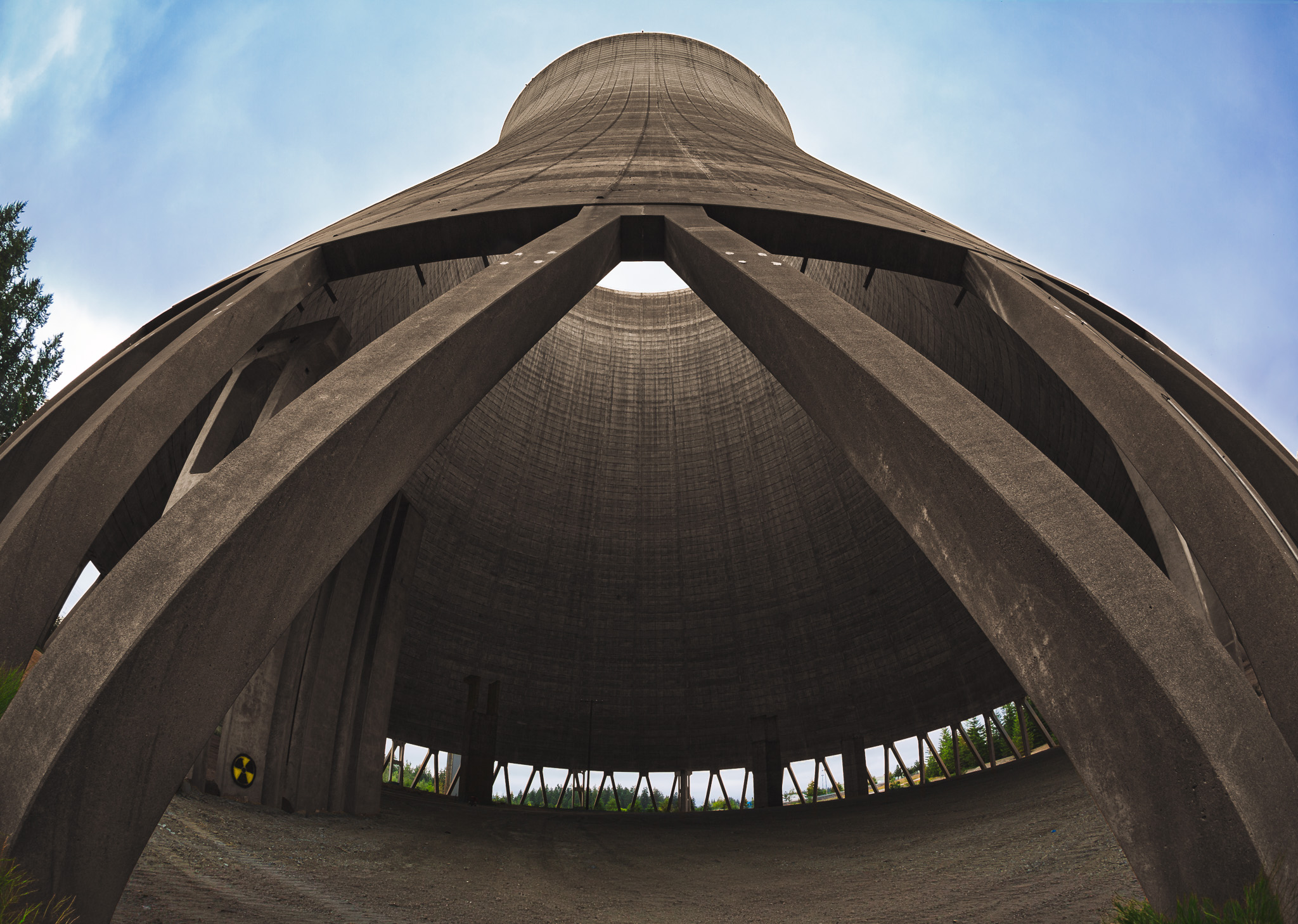
The two versions are genuinely different photos in spirit, not just in tone. The 2012 edit exposes shadows everywhere and looks, fittingly, irradiated. The 2026 edit preserves more natural shadow falloff and lets the structure read as something nature is quietly reclaiming rather than something aggressively stylized. I don't think one version is objectively better — but it's a good marker of how much an eye for editing shifts over 14 years.
It's Time to Learn How To Use Lightroom Everywhere!

If you enjoyed this topic and want to learn how to get the most out of Lightroom's cloud-based ecosystem on the desktop, smartphone, and tablet, then you should check out my Lightroom Everywhere course! It has over 13 hours of easy-paced lessons that'll teach you how to make the most out of Lightroom Desktop, Mobile, and Web.
The Only Course Designed to Help You Use Lightroom Everywhere!


