Old Photo, New Workflow: Advanced Lightroom Editing in Action
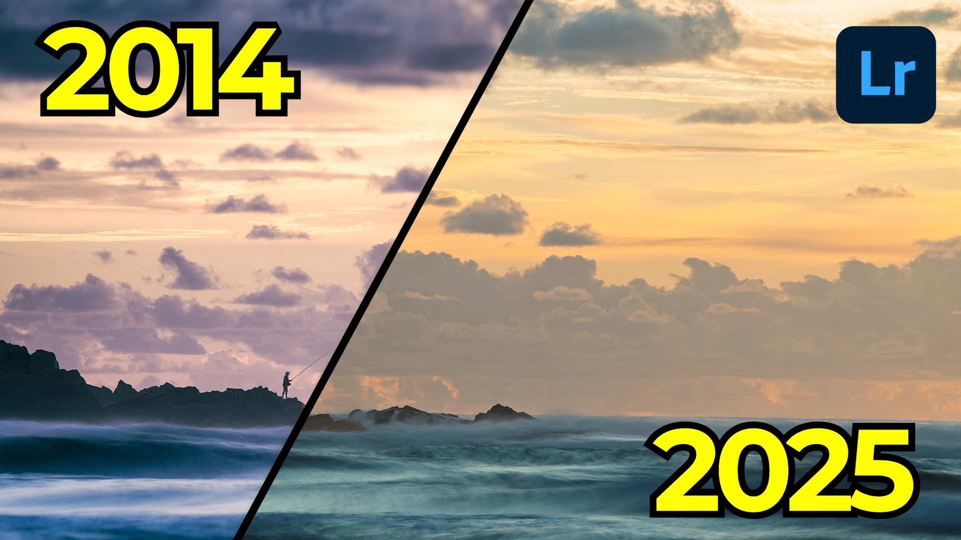
Back in 2014, I captured one of my favorite sunrise scenes at Tallow Beach in Byron Bay, Australia. The composition, timing, and conditions came together beautifully, and I was happy with my original edit at the time. But now—over a decade later—with new tools, techniques, and an evolved editing style, I wanted to revisit the image with fresh eyes.
This post is the first in a new “Then and Now” series where I take older photos that I once edited and rework them using the latest version of Lightroom. The goal isn’t always to “fix” a bad edit. Sometimes, the original holds up decently. But even subtle re-edits can reveal a lot about how much our aesthetics and toolsets have matured.
The Original (2014): What I Got Right—and What I Didn't
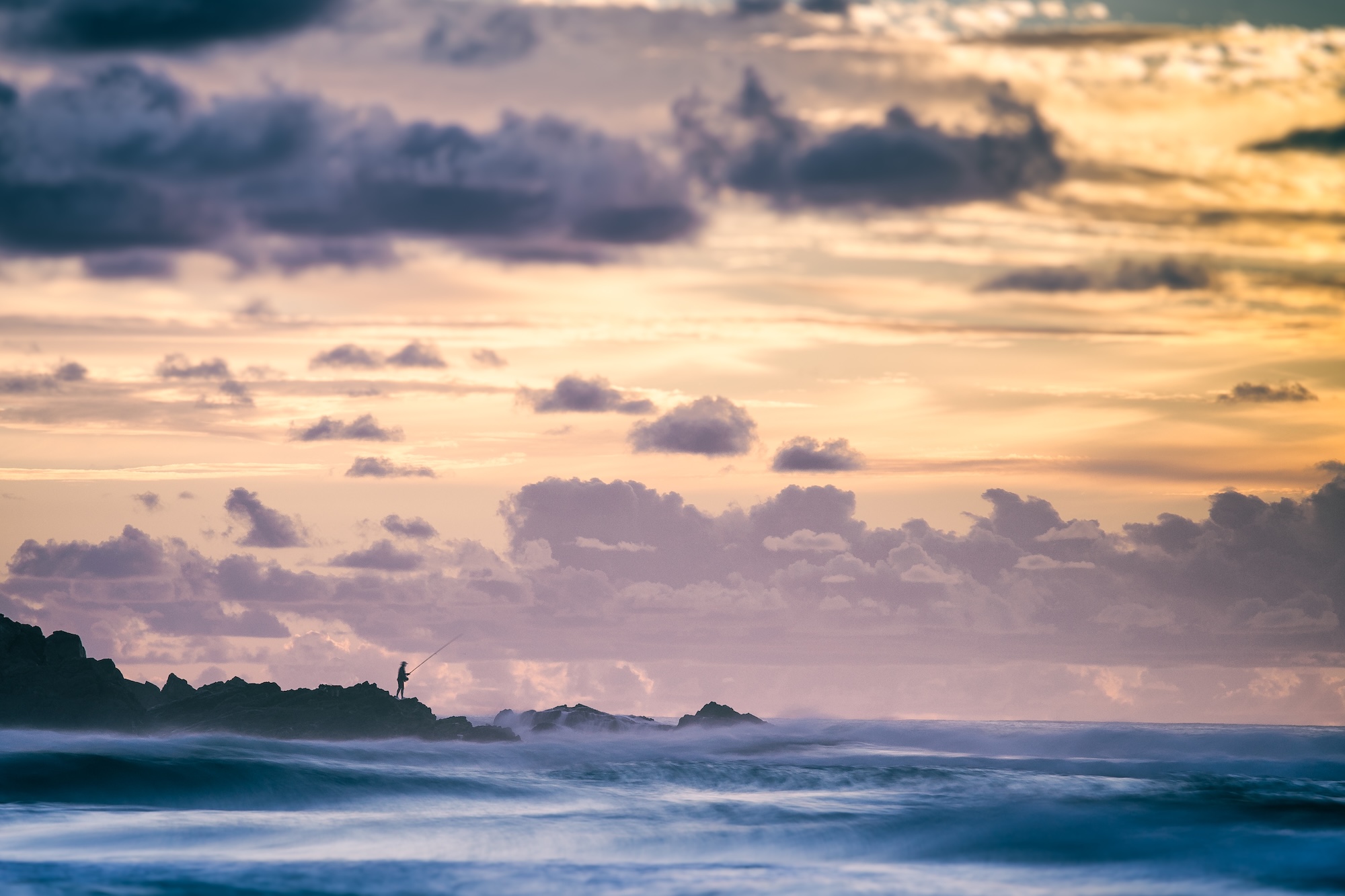
The original image was shot with a Sony a7 and a 70-200mm lens at ISO 64, f/8, and a one-second exposure. That slower shutter speed added some pleasing motion blur to the waves, while the silhouette of the fisherman remained mostly sharp—except for a bit of upper body movement. Overall, the bones of the image were strong.
But the edit? Well, let’s just say I made some interesting choices:
-
Blurring the sky to draw attention downward felt unnecessary in hindsight.
-
Over-accentuated blues in the water didn’t reflect the natural warmth of sunrise.
-
Crushed cloud shadows added more drama than I’d want today.
That edit wasn’t awful—but it leaned heavily into a stylized approach that no longer resonates with me.
The Re-Edit (2025): Subtlety, Precision, and Better Tools
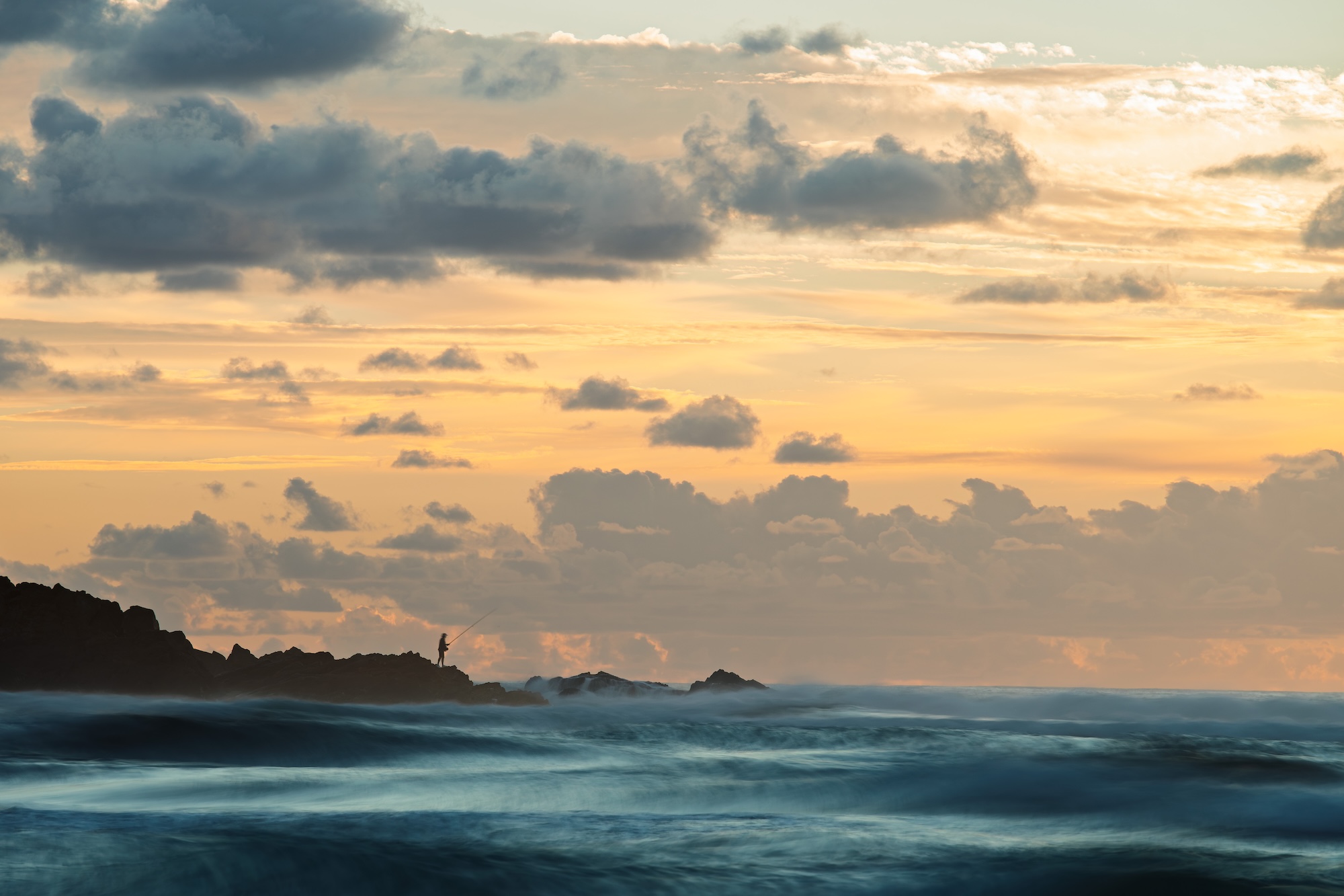
Starting fresh with the original RAW, my first move was to apply AI Denoise, which is now rightfully placed at the top of the edit stack in terms of order-of-operations. Even at default strength, it helped clean up subtle noise without affecting detail.
Next, I used Generative Remove to clean up a distracting second figure and fishing pole from the scene. With a few brush strokes, they vanished cleanly—something I couldn’t have pulled off so convincingly back in 2014.
From there:
-
White Balance was corrected using the eyedropper tool, removing a blue cast.
-
I applied an Adaptive Color profile, tweaked the black and white points, and dropped the highlights and shadows selectively.
-
Rather than using the contrast slider, I built an S-curve in the point curve panel for finer control.
Targeted Adjustments with the Masking Panel
The real magic came with Lightroom’s landscape masking tools, which created separate masks for sky, mountains, and water. From there:
-
I added dehaze and texture to the sky to define the clouds.
-
I created a more defined silhouette for the mountains by adjusting exposure and shadow.
-
For the water, I intersected luminance masks to selectively dodge the highlights and burn the shadows, making the waves pop without going overboard.
Finally, I fine-tuned sharpening with a low radius and masked it to protect the smoother areas.
The Side-by-Side: Then vs. Now


Seeing both edits side-by-side drives home how much can change over time. The updated edit feels more balanced, natural, and subtle—less about heavy-handed effects and more about guiding the eye through contrast, texture, and tone.
I didn’t hate the original, but I definitely prefer the newer version. It’s a great reminder that sometimes your older photos deserve another look—not because they were “bad,” but because you’ve grown.
If you want to dive deeper into landscape photo editing and develop a streamlined, creative workflow using Lightroom, check out my course, Lightroom Landscapes. With over four and a half hours of lessons, it’s designed to help you master these techniques and more.
The Only Course Designed to Help You Use Lightroom Everywhere!


