11 Years Later: Same Photo, Way Better Results
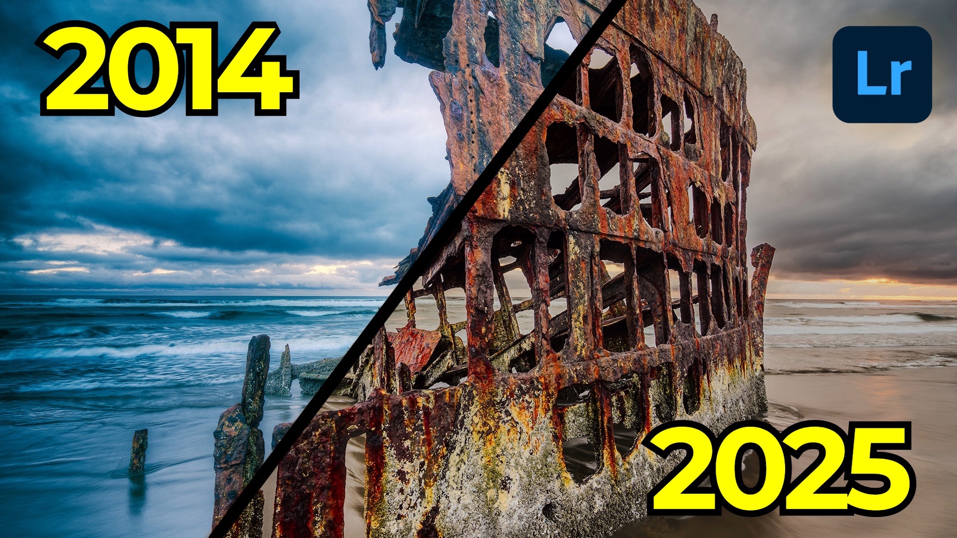
Every now and then, it’s worth revisiting old photos—not to cringe at past choices, but to see how far you’ve come. Our tools evolve, our taste evolves, and more often than not, a fresh look at a familiar photo reveals new possibilities. That’s the thinking behind my Then and Now series, and for this installment, I’m jumping back to 2014 and re-editing an image of the Peter Iredale shipwreck along the Oregon coast.
This four-masted steel bark ran aground in 1906. I photographed it 108 years later using the original Sony a7R along with the Canon 17mm tilt-shift lens—back when Sony’s lens lineup was still young and adapting older glass was pretty standard practice. That setup allowed me to capture two shifted frames (a top and bottom half) and stitch them together into a clean panoramic composition.
At the time, I relied heavily on tools like Photomatix for HDR tone-mapping. Lightroom didn’t yet offer the HDR or panorama merge tools we now take for granted, so achieving the look I wanted meant bouncing between apps. Fast-forward to today, and everything from HDR merge to pano stitching to advanced masking exists directly inside Lightroom. Revisiting this old image with the current toolset really highlights how much easier—and more effective—the workflow has become.
Modern HDR + Pano Workflow
Instead of building HDR brackets in one app and stitching elsewhere, Lightroom now handles both steps at once. By selecting all six frames (three exposure brackets for the top half and three for the bottom), I can run Photo Merge → HDR Pano in a single pass.
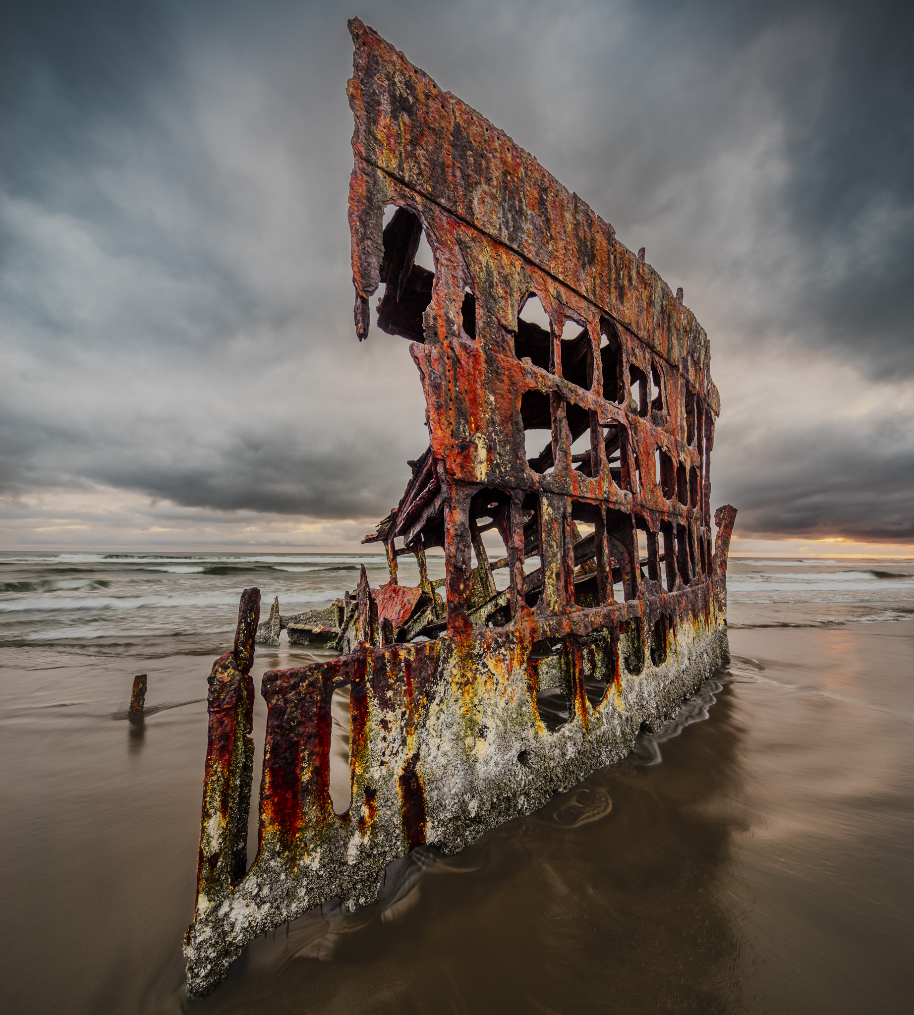
Using a tilt-shift lens pays off here: because the camera was leveled and only the lens was shifted, there’s almost no distortion or missing corner data. A quick switch to the Perspective projection keeps lines straighter and preserves the feel of the original scene.
Once the merged DNG is created, I start with basic color and tonal corrections—dialing in temperature with the white-balance dropper, removing unintended saturation boosts from Auto Settings, and choosing a Landscape profile for a slightly richer base.
Why Masking Changes Everything
Where this edit truly diverges from the 2014 version is in selective control. Lightroom’s masking panel has become the heart of my workflow.
Isolating the Shipwreck
I experimented with both Adaptive Subject and Object masking. In this case, the Object tool produced a far cleaner selection of the ship. From there, I added a custom S-curve, introduced texture and clarity, and cooled its color temperature slightly to bring the rust tones into a more natural range.
Treating the Background Separately
By duplicating and inverting the ship’s mask, I created a precise background selection. This allowed me to apply a second S-curve that lifted the black point and softened highlight roll-off—giving the sky and sand a gentler, less contrast-heavy look.
A Sharper Sky Selection
Lightroom’s sky detection does a solid job, but one of my favorite tricks is to intersect the Sky mask with Sky again. This refines the edges, especially around complex shapes like the ship’s rigging. A touch of dehaze and lowered highlights restored definition without returning to the hyper-dramatic look of early HDR processing.
Hand-Built Vignetting and Atmosphere
Rather than relying on a standard vignette, I used a radial gradient, inverted it, and then subtracted the shipwreck using the Object tool. This lets the vignette shape the mood without darkening the subject.
A luminance-range subtraction helped prevent the vignette from crushing shadows in the lower corners. Then a subtle linear gradient at the top added atmospheric depth without pulling attention away from the foreground.
A Final Touch With Color Variance
Lightroom v9 introduced Color Variance, and applying it directly to the shipwreck produces a surprisingly impactful result. By sampling one of the rust tones and pushing variance to the right, complementary tones separate and become more distinct. The effect isn’t loud, but it creates color contrast that feels richer and more dimensional.
Then vs. Now
Putting the 2014 version next to the 2025 edit makes the differences unmistakable. The composition is identical, but everything else—tonal balance, color treatment, detail handling, and especially selective control—feels more refined. That shift isn’t just about tools; it’s about taste. What looked dramatic and exciting in 2014 now feels heavy-handed to me, but there’s nothing wrong with that. Growth is part of this craft.

If you’ve got old favorites tucked away in your archive, revisit them. Approach them with the skills and tools you have today. You might be surprised by how differently you interpret the same moment.
It's Time to Learn How To Use Lightroom Everywhere!
If you enjoyed this topic and want to learn how to get the most out of Lightroom's cloud-based ecosystem on the desktop, smartphone, and tablet, then you should check out my Lightroom Everywhere course! It has over 12 hours of easy-paced lessons that'll teach you how to make the most out of Lightroom Desktop, Mobile, and Web.
The Only Course Designed to Help You Use Lightroom Everywhere!


